We strongly believe that sometimes all your art needs is a face-lift for you to fall in love with it again - and by that, we mean new mats, and sometimes a new frame. One of our favourite reveals is the “Before & After” to the customer; where they get to see the finished product, the new choices they made versus the way their art used to look.
To illustrate the power of a good Before & After, we’ve pulled a few examples below:
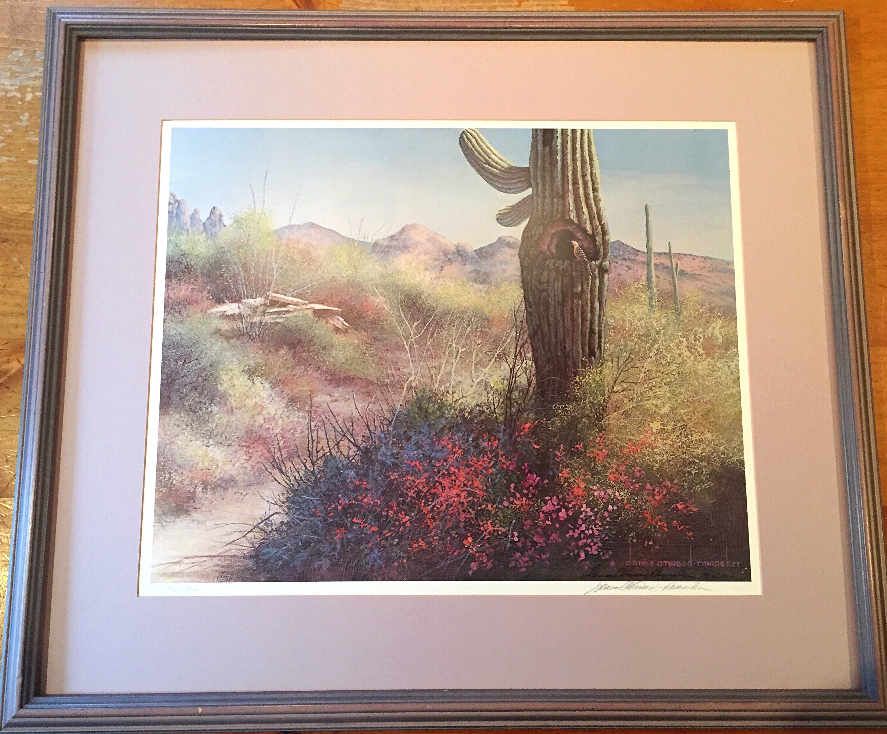 
Our customer loved this print, but not the dusty rose mat and frame. Mats serve two purposes: they raise the glass away from the art, giving it space to breathe; they also draw your eye to certain aspects of the art, depending on the colour of mat chosen. In the “Before”, the pink mat draws your eye across the path and mountains, and makes the flowers at the forefront the first thing you see. The original frame continues pulling the pink tones, and adds more lines to the outside of the piece.
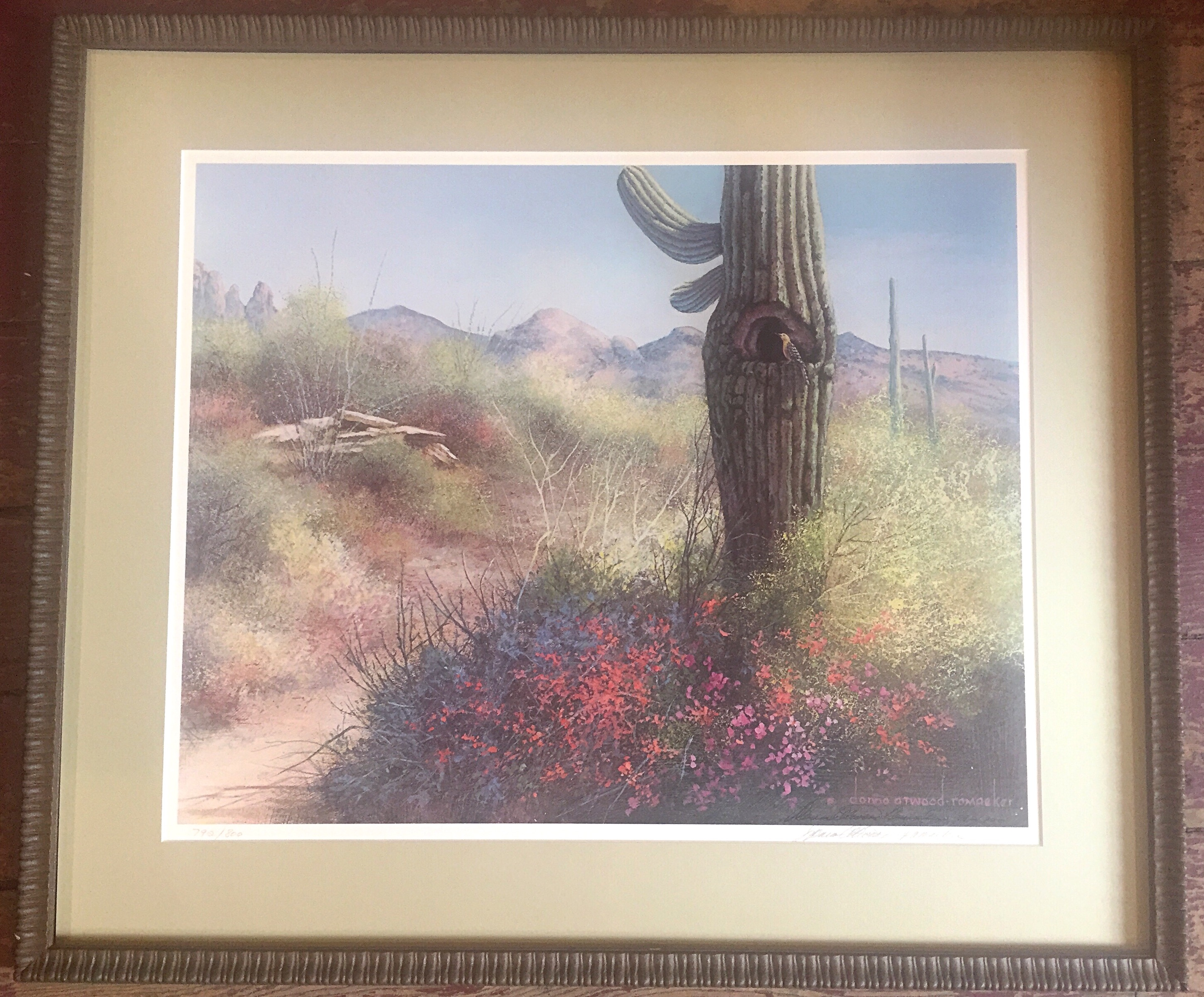
For the “After”, we chose a pale green with citrus undertones, which calms the pink in the image, and instead highlights the fresh growth and bird perched in the cactus. While the flowers are the brightest point of the image, they’re no longer the focal point. Instead, the scene looks fresh and green, just like after rainfall. We chose a frame that was soft and organic, emulating the lines and colour of the cactus.
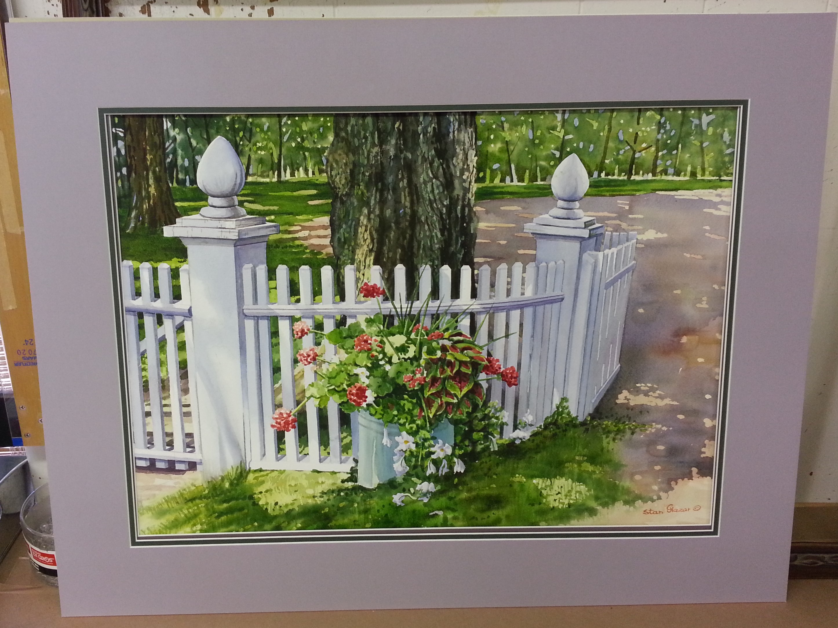 
The next set of photos illustrates the dramatic effect that a different mat can have on an image. The purple of the “Before” draws out all the cool shadows in the watercolour; from the shadow under the fence to the shadow behind the tree, it has a cool and dappled feel to the overall image.
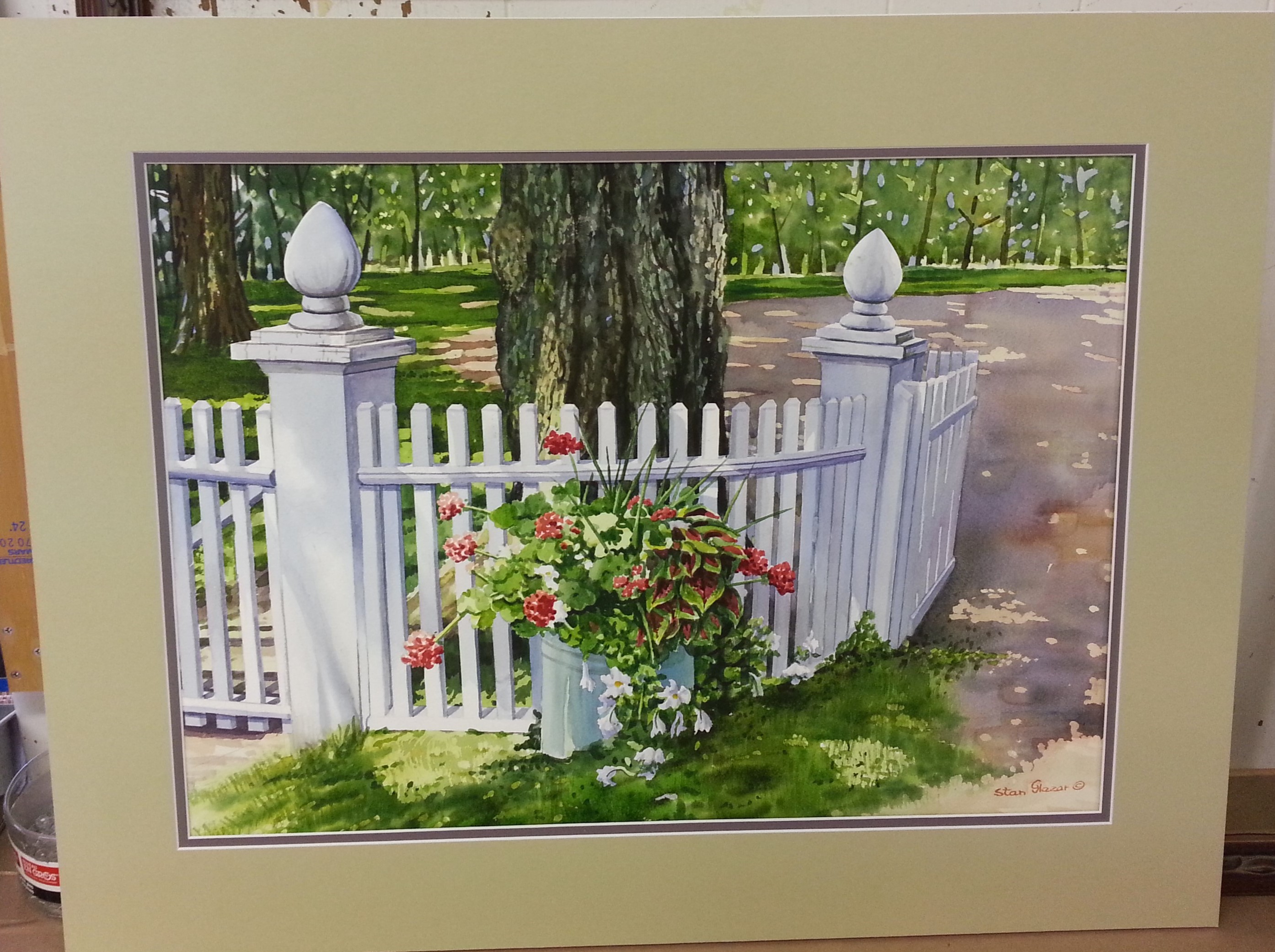
The “After”, a pop of citrus pale green, makes all the foliage the star of the show. The shadows are still there, but no longer the focal point of the piece; instead, the image is brighter and focuses on the light, making the fence seem brighter too.
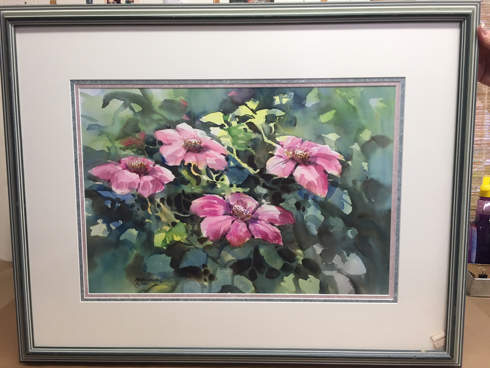 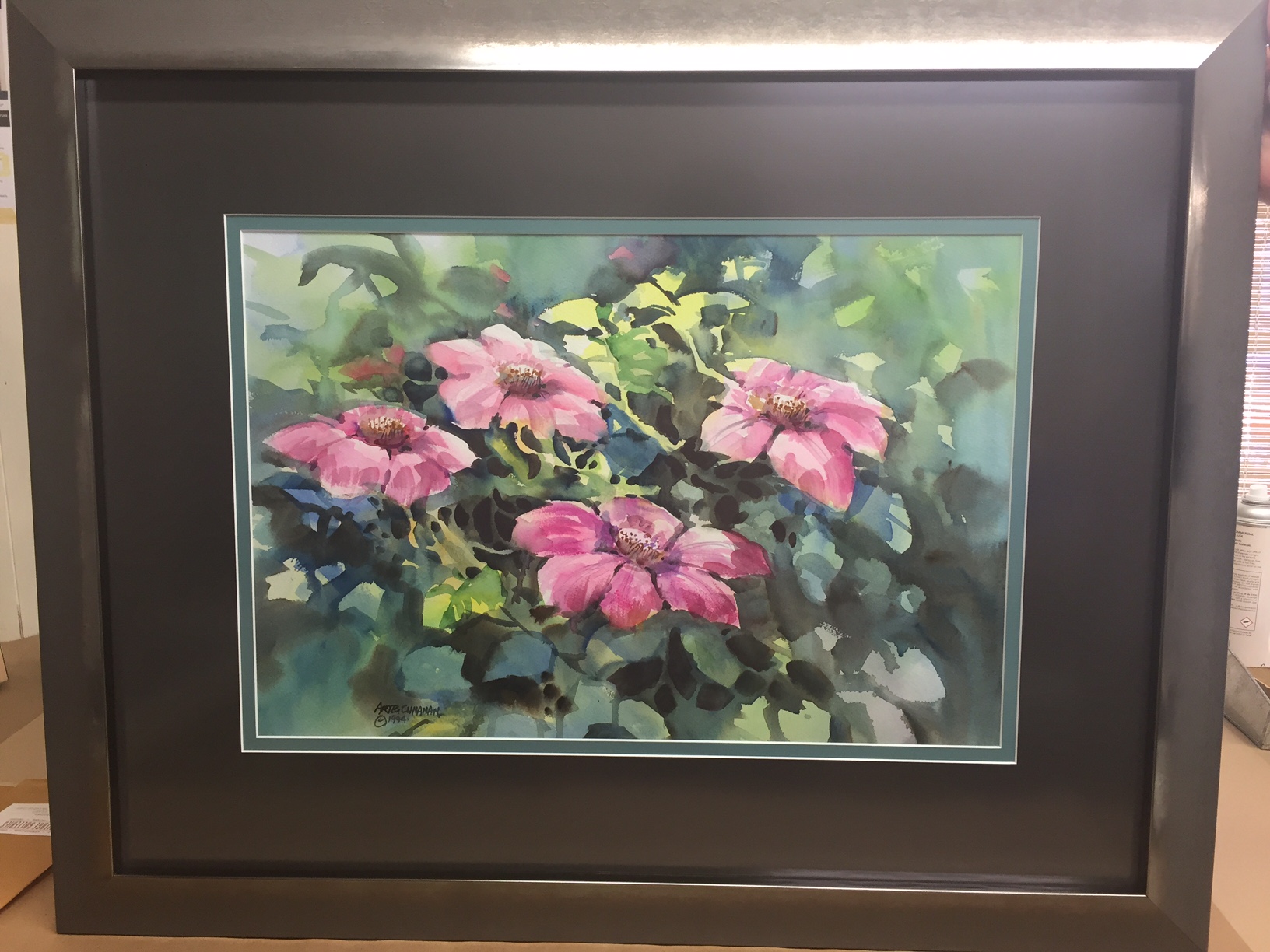
The final set is probably one of our favourite transformations - disclaimer; we have no issues whatsoever with the Eighties! That being said, this floral watercolour was in desperate need of an update that would suit our customers’ bold and bright taste.
The “Before” featured a triple mat with a pale upper, which drew your eye out from the image. In contrast, we catered to our customers’ love of bold and chose a dark mat for the “After”. This lets the flowers be the star of the show. The frame now is sleeker with a slight metallic overtone, giving a more modern aspect to the piece.
A good rule to remember, (as this example demonstrates) is that generally light mats draw your eye to the dark parts of the image, while dark mats draw your eye to the light parts of the image.
There’s no one right way to frame a piece of art; it just depends on what you want the focal point to be!
|


 613.345.5382